Warrior Soccer Training
RESPONSIVE BRANDING KIT
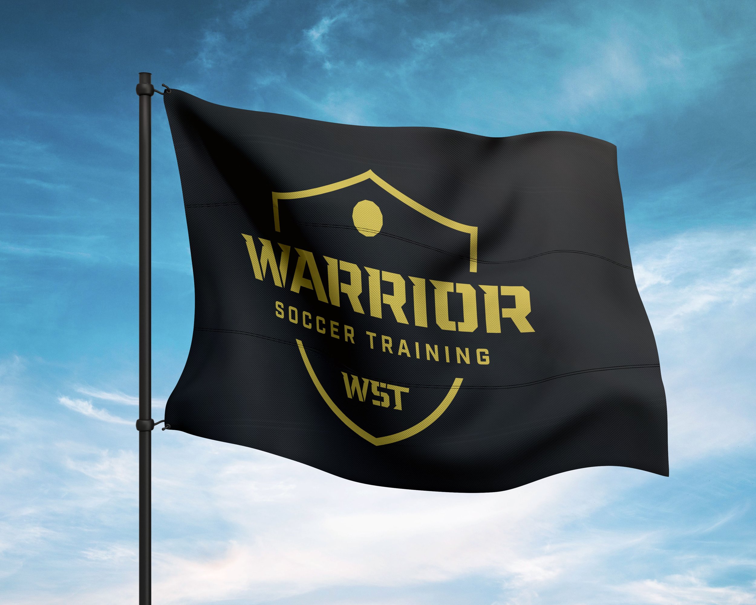
Details make this logo shine. For the Warrior Soccer Training main brandmark, I created complex stenciling and custom serifs. These custom type treatments make this one stand out!
Rather than using a circle for the badges in this branding kit, I used a truncated icosahedron. This shape was used intentionally since it is the geometric shape of a standard soccer ball.
The standard soccer ball is stitched or glued together from 32 polygons, 12 of them five-sided and 20 six-sided, arranged in such a way that every pentagon is surrounded by hexagons.
Using this shape is just one of the many examples of how I bring a unique personality into every branding package I create.


Project Impact
CREATED A LOYAL PACK OF MEMBERS
The new branding allowed for the creation of a variety of merchandise that built a loyal following. Members felt a sense of community at the new facility that aligned with Ashley’s personality and expertise.
The branding also gives the owner and her team a greater sense of pride in coaching together.

Ashley Myers, Owner
Client Testimonial
“We couldn’t be more thrilled with our brand package for Warrior Soccer Training from Ecker Design Company. Mike was amazing to work with.
He was accommodating, patient, professional and timely, and he took the time to listen to exactly what we wanted. Mike’s talent, expertise and artistry are unmatched in his industry. Highly recommend.”
Responsive Branding Kit