Hand-Crafted Designs That are as unique as Your Business
Helping San Diego Businesses Grow by Making Them Look Amazing Through Murals and Graphic Design
Thanks for dropping in!
I help businesses make waves with hand-crafted designs that brew up customer-to-brand connection.
It’s a crowded lineup out there. Let’s get you on some waves!
Check out Our Brand Story Video
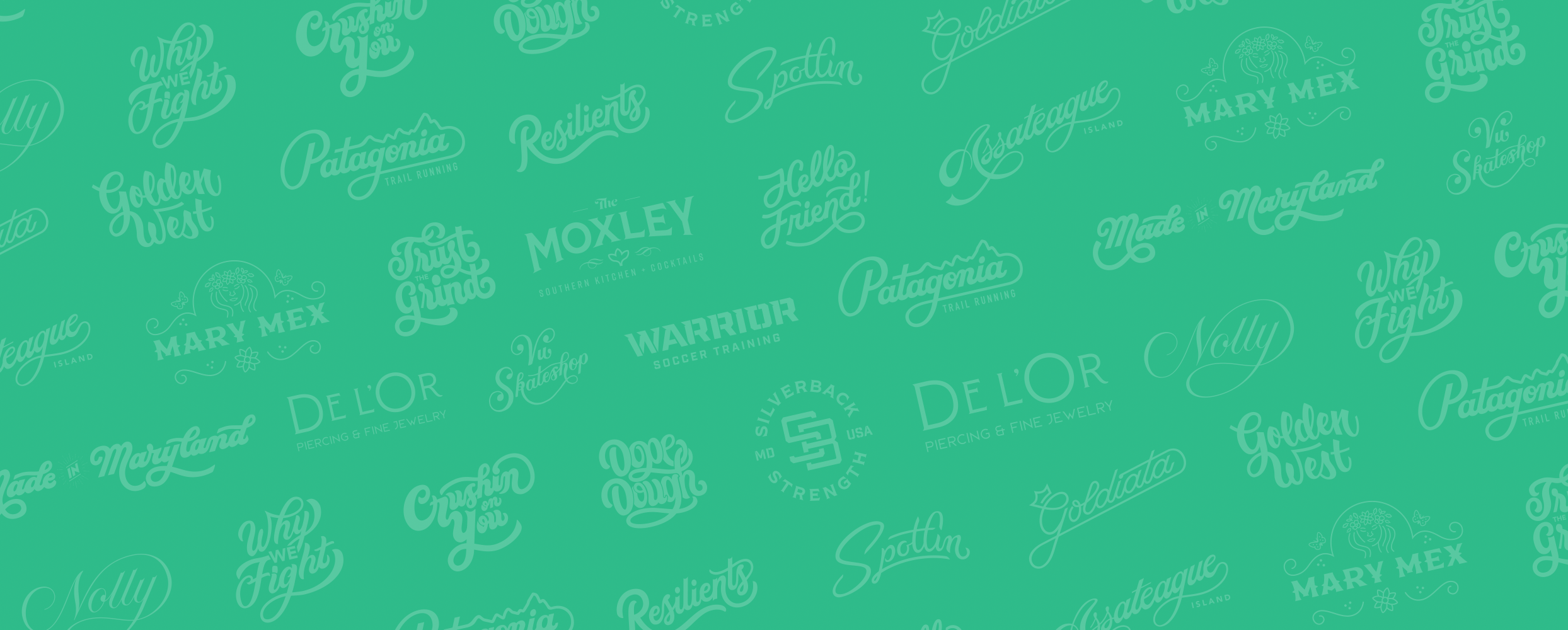
Brands Mike Has Collaborated with


Core Services
-
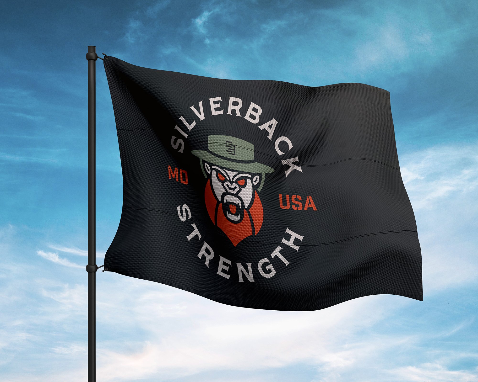
Hand-Crafted Logo Design will embrace your brand’s personality, make it more approachable, cut through the digital noise, and make it stand out from the pack.
-
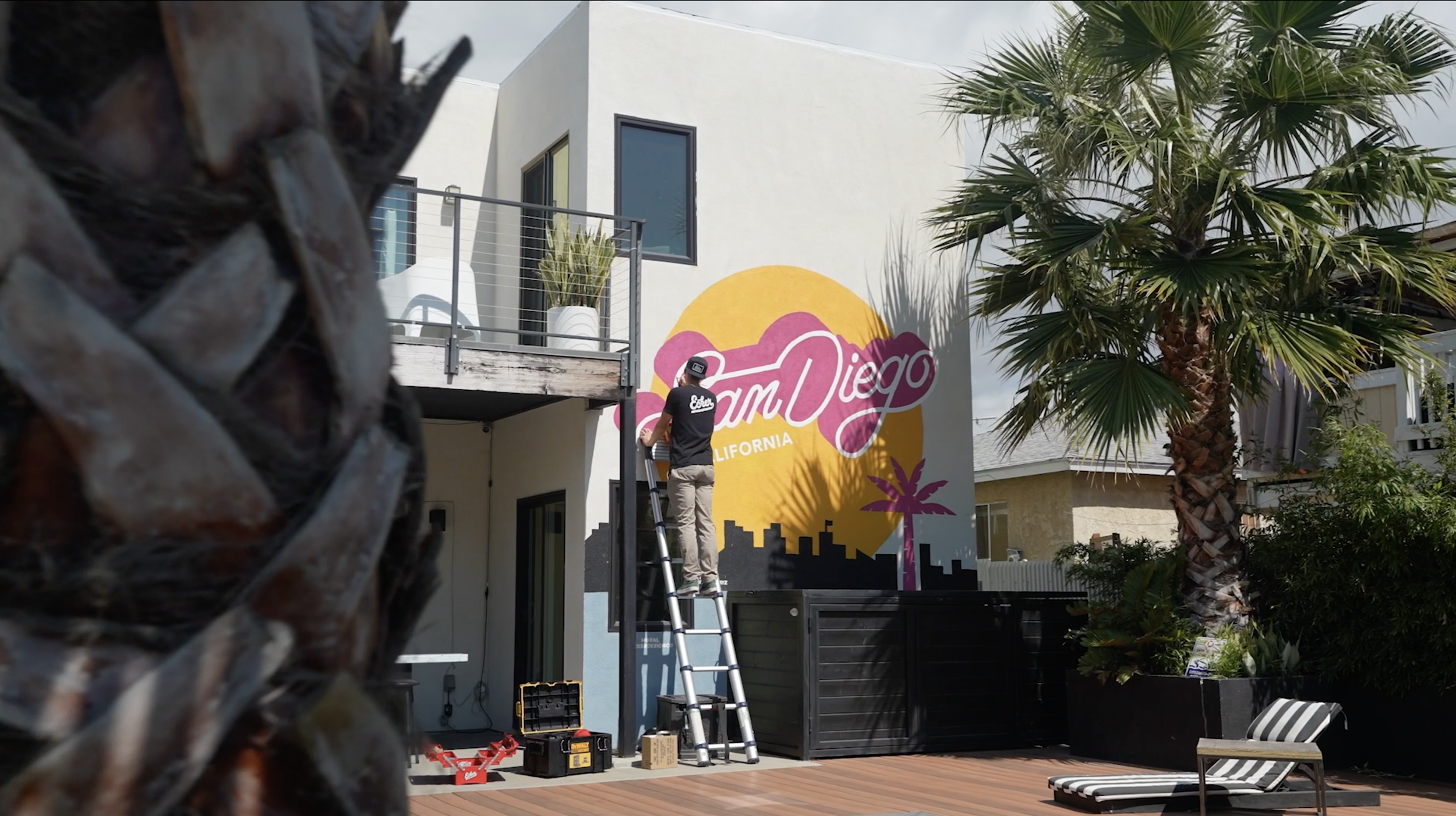
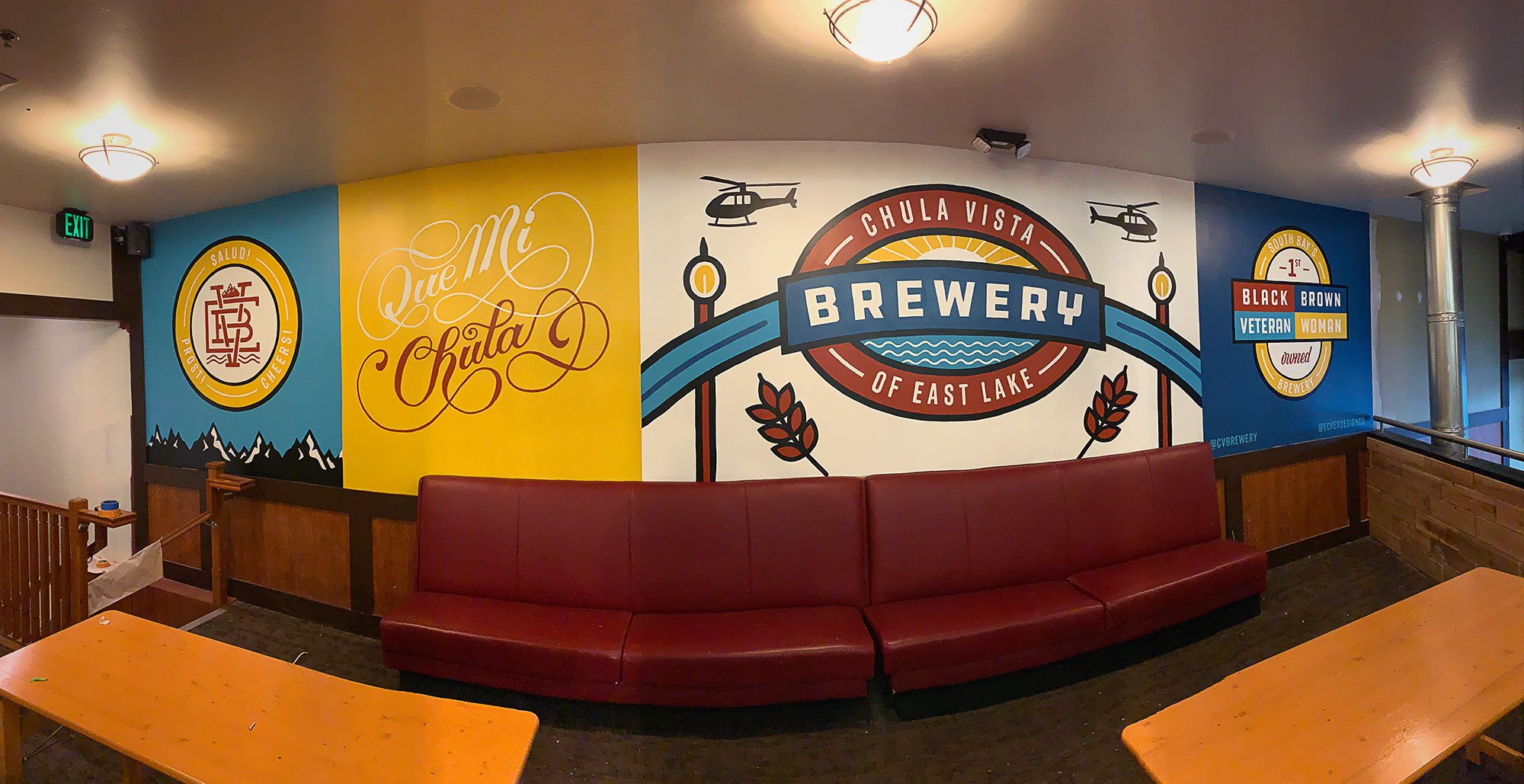
Create an inviting space people want to visit. Murals are a great way to attract new customers through in-person experiences and social media.
-
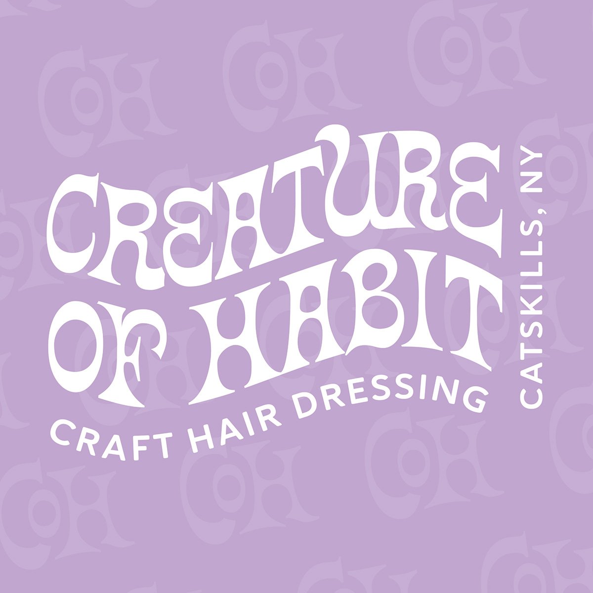
Custom lettering is a form of evocative communication that will amplify the personality of your message. Hand lettering creates a genuine connection between our clients and their target audience. Your company deserves individually tailored hand-crafted design solutions.
-
Illustration creates a genuine connection between our clients and their target audience.. Your company deserves individually tailored hand-crafted design solutions.
-
Make your space breathe your brand by getting your mark up on the wall. This option will impress clients, inspire employees, and show off your existing brand. I will recommend stylings using your existing brand to get your artwork looking amazing in your space.
-
What you do is special. Your vision deserves to stand out. Custom branding treatments will embrace your brand’s personality. Let’s create something that is 100% tailored to your business.
-
Traditional graphic design with an emphasis on making your content easily digestible and interesting to look at. Projects ranging from Website Design, Collateral Design, Mobile Application Design, Event Branding and Signage, Animation, Presentation Design, UX/UI, and more!
-
Having trouble launching your website? Get your business online with an easy to use Squarespace site. Website design packages include a 1-on-1 tutorial. This session covers creating new pages, change site stylings, and managing your site.
-
I use my iPad to draw directly on the package template. Whether it is for retail packaging, beer labels, or food boxes, being able to digitally draw on the final product allows for the most creative solutions. I dial in exact product specs and alter the shape and structure of the design to best fit the end goal.
-
I can help your space breathe your brand by getting your mark up on the wall. This option will impress clients, inspire employees, and show off your existing brand. We can consult with you to make objective design decisions to get your artwork looking amazing in your space.
Featured Projects


Mike’s Core Lineup
-

Build trust and effectively speak to your audience with personalized logo design and branding.
-

Attract new customers through in-person experiences and social media with a colorful mural.
-

Express and amplify the personality of your messaging and business with illustration.

Jon Hoffman, Vice President – Land Development & Construction
Chesapeake Realty Partners
CLIENT TESTIMONIAL
“Our overall experience was great. This was a huge 300-foot mural that was going on the side of Sea shipping containers along a very busy road. Mike was very open about the schedule of the project and hit his dates even though he was working through the summer heat.
Mike created an immersive streetscape image for cars and pedestrians passing by. He educated us on how the design would look in real life which allowed us to get the scale of our logos correct.
The feedback from this mural has been excellent. Since many people did not know what was behind this wall of containers, this graphic makes it known that something fun and exciting is going on and people drive around to find out. It also created a landmark and directional signage for the entire area that has added interest in intrigue to the surrounding businesses.
Hiring Mike is a no-brainer for any graphic design, mural, and specialty paint projects. He has shown that he can do it all. Mike is honest and upfront keeps his word, and gets the job done.”
WHAT DOES A PROJECT LOOK LIKE?
Design Process
There is a lot more to the finished product of a project than creating something that is just nice, clean, and pretty. The entire process is focused on the success of your business. It is a little more involved than most designers but I have found that this additional work really uncovers some of the magic of creativity. This allows a result of you attracting new customers, retaining existing ones, and feeling amazing about your business.
-
After your inquiry, we will set up a time to connect on the in-person or on a video call. During this call, we will work through a series of questions that will make you think hard about your business. The goal here is to bring out all of the things that make your business special so we can make you look much better than the competition!
-
2-3 business days after our initial call we will hop back on the phone to review a proposal. The proposal will feature three different packages based on your design needs. Once you have taken the time you need to review the package options I will create a contract for the project. We will then schedule another meeting to review the contract. Walking through all of the deliverables and sections to ensure that we are on the same page. I requires a 50% deposit in order to start the project.
-
This is the first part of the design process. Before even picking up a pencil and paper I will study your industry. Learning more about your competition so we can understand what makes you stand out in your industry. By cross-referencing the notes from our initial call I create a moodboard with historical examples on potential design directions. You will have access to this gallery of images with the ability to comment and rank your favorites.
-
From our session reviewing the moodboard I will present a formal written concept to pursue during the sketching phase. Once approved I will create a number of sketches that follow the agreed-upon direction. We will then hop on a video call for the presentation of these sketches. From here we pick a direction to pursue for the remainder of the project.
-
This is where the magic happens. During this stage, I channel all of the information from our calls and research. Perfecting every inch and pixel of this project.
-
After all of the work is complete we will schedule a meeting for the presentation of the design. In this meeting, we will review all of the design decisions made to that your project complete. This is your look behind the curtain. It is the best part of the project to see our ideas come to life.
-
Once the final payment has been made the deliverables of the project will be delivered to you.