Bezier Tutorial

Bezier: Best Practices For Vectorizing Lettering
In this post I review and explore the world of the Bezier. This walks you through his process, from taking a sketch to vectorizing it in Adobe Illustrator using the pen tool.
As with everything, there are a million ways to do this. I’m here to share with you some ideas that I find useful when vectorizing lettering. Let’s get started… so what is a Bezier?
A Bezier curve is a mathematically defined curve. The shape of a Bezier curve can be altered by moving the handles. The mathematical method for drawing curves was created by Pierre Bézier in the late 1960s for the manufacturing of automobiles at Renault in France.
Getting Started
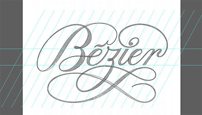
First, draw a badass sketch. Simple, right? A little easier said than done, but you get the idea. Feel free to use my sketch for reference or another piece of lettering you love. This is a great way to dissect your hero’s work and understand how they think. As long as you don’t claim their work as your own, there is nothing wrong with this.

I created the above to use for this post. There are multiple ways to transfer your sketch to your computer, but I recommend using the Scanner Pro app for mobile devices. I’ve tried using fancy scanners, but this app is very simple and gives you more than enough quality to work with. I created this image using Procreate on my iPad Pro, so I was able to export the artwork and share it to my computer using Airdrop.
Next you will want to set up a folder for the project. It’s very helpful to be organized from the beginning. In my project folder I generally create many sub folders. These can include files for assets, contracts, illustrator, process photos, final photos, reference materials, or mood boards.
Now create a new document in Adobe Illustrator and use an appropriate file naming convention. Again, it is better to start this process sooner rather than later. Here is an example of how I save my files…
EDC_2020_BEZIER_TUTORIAL_ARTWORK.AI

For this piece I set up a square artboard and centered the scan image using the align functions. Then I created new layers for the lettering and guidelines.
Generally this point in the process is when people set up their guidelines. I find that setting up guidelines at this time makes me biased when plotting my anchor points. I find that it helps to plot all of your points, take a pass at the curves, and then set your guidelines. When you set guidelines before setting your points, you can get too mechanical and your lettering will feel stiff. I have found much better results when I balance referencing my original sketch with guidelines.

Next, I recommend double clicking your Scan layer to reveal the Layer Options window. Check the box “Dim Images to” and enter 30%. This will allow you to see both your paths/points, and original sketch. Click ok, then lock your Scan layer.

Moving to the Lettering layer, begin plotting points with the pen tool. A great tip from Ryan Hamrick is that “Mo Beziers, mo problems”. You would think that using more points would be more precise, but it ends up being the opposite. Therefore, one of your goals should be to try and plot as few points as possible. Doing so while ensure smoother curves.
The best place to start plotting points is at the north, south, east, and west, extremas. If you have a hard time finding these points, a helpful way to find them is by using the rulers (command + r). Pull a guide from your rulers and drag it to the edge of the letter. This will be an ideal place to plot your point.

Now, go around each letter form plotting your points. Don’t worry about pulling the handles quite yet. Focus on getting something similar to the above (I’ve added guidelines to help show the extremas). Notice how I have stopped the shape in the bowl of the “e” and at the accent marking above the “e”. Although this piece of lettering is one fluid shape, it is not ideal to make it whole. By doing so the refinement stages would become much more difficult, especially when kerning.
Also, just because a letter ends doesn’t mean you should complete your path. This will complicate your hairline connector strokes and cause headaches later. I realize this is a lot of information, but this is a learning process and the best way to learn is by making a ton of mistakes and figuring out what works best for you.

I want to provide some additional tips when plotting points (reference the above image). I have chosen to fill all of my smaller loops in the piece. Rather than going around the border of the shape, I followed the original strokes. Yes this will leave a gap, but gaps can always be filled with an additional shape later. This piece does not have any super extreme points, but when you do have a sharp point, zoom very close and create two points rather than one. A single point will cause awkward angles when you start pulling your handles.

Continue going around plotting points on your piece until you have everything accounted for. You should have something similar to the above.
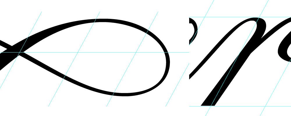
Now that we have all of our points placed, we can start pulling the handles and create our curves. Since we have placed our points at the extremas, we can pull our handles vertically and horizontally by holding down the shift key. When possible try to use these angles to ensure the best results. There are instances when you can’t use vertical or horizontal handles but we will address them later.

Although you might be able to complete a curve only using one handle, you want there to be a balance between the two. How I like to think of it is this: imagine you were moving something heavy. Yeah, you could probably move it by yourself, but wouldn’t it be nice to share the load? Try to get your handles carrying the same amount of “weight” for the best results. See above for the examples of both cases. The left image is incorrect where the right is a correct balanced approach.

One part where the vertical and horizontal handles don’t work is on the lowercase “I” (see the above screenshot). These points will later be refined with our guidelines.

Now that we have this step done, I duplicate my artboard. I recommend doing this as much as you can. A lot of time can be saved in the refinement process when those quick “let me try this” moments come. You know, the times when an hour later into tweaking you have ruined your artwork? Duplicating artboards allows you to explore these new ideas while preserving your old ones. Remember, artboards are free!
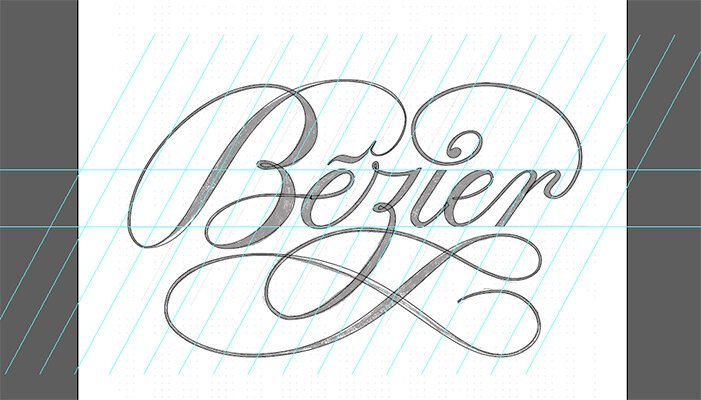
Now I create my guidelines. I have them from my original sketch, so I have recreated them.

At this time I start my revisions. It’s always a good idea to have your lettering filled in. You can easily do this by using the keystroke “shift + x”. Doing so will give you a greater understanding of the color (weight).
Looking at the image above, two mistakes I see are the downstroke of the stem of my “r”, and an unbalanced loop on my “z” swash. The “r” stem does not align with the guides, thus making it lean away from the rest of the piece. As for the loop, the intersection point and edge of the curve should share a center axis. On my swash the intersection point is higher. This will be need to be addressed along with many other mistakes throughout my piece.

After making my preliminary adjustments, I duplicate the artboard (again!) and flip the piece upside-down. Doing so allows me to look at the piece as numerous shapes rather than as letters and words. Generally this will reveal other awkward spots in the lettering.
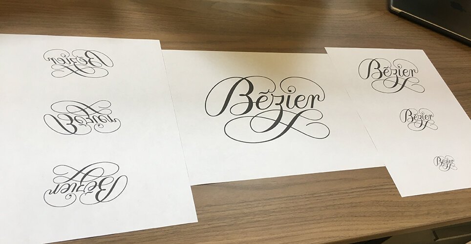
Next I print the piece out. I copy and paste it into a new document at a variety of sizes and orientations in order to critically look for any other adjustments. A helpful practice is to open your eyes as wide as you can and then squint at the piece. Doing this will blur the lettering, but allow you to see any hotspots in the composition that are attracting too much or too little attention. Printing out your piece allows you to look at it with fresh eyes, and you will most likely see a bunch of areas that you generally would miss while looking at it on the computer.
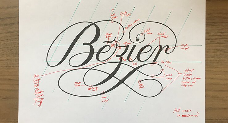
I mark up everything I see on one sheet, come back into Illustrator, duplicate the artboard, and continue refining.

Taking a final look, I select my piece with the direct selection tool to reveal the points and handles. I take another scan to make sure everything is smooth and balanced.

Once I feel satisfied with my revisions, I go about styling the lettering. Although it is tempting to color and stylize earlier on, it is crucial to wait. Doing so will allow you to look at your composition with an unbiased eye. If you can create something that looks amazing using just black and white, when you add color it will truly sing. I went minimal for this piece and inverted the color scheme, as this post is more about shapes than styling.
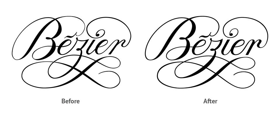
In the images above you can see the before and after comparison of the lettering piece. Here are some things that stick out…
KEY REVISIONS
Adjusted the angle of the capital “b” bowls
Added weight to all hairline strokes
Adjusted accent marking
Changed angle of “z” descender
Increased color of the “i”
Refined second “e” to resemble the first one
Aligned downstrokes of the “r” with the guidelines
Added color to both downstrokes of the “r”
Hopefully, you found this post helpful. Thank you for going through this process with me. I would love to hear your thoughts and would really enjoy seeing any work you create as a result. Also, if you are interested you can check out my sketching process in the video below. ‘Til next time!